
case study·July 20, 2026· Michal Klobušický
BARRIQUE: a new identity for an old address
Written by Michal, the designer responsible for identity and design at NOUSOOS. This is the first piece in a series where we show how our work actually comes together. Dead ends included.
What it was about
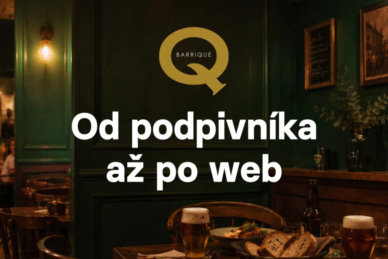
BARRIQUE is a restaurant in the centre of Žilina, Slovakia. An old address the locals know, though its former glory had slowly faded. Twenty years after it first opened, it is coming back. Better and stronger, with honest food, great beer and bread baked in-house. No fancy gastro theatre — more a place people love coming back to for the easy-going atmosphere and good food.
The brief was simple: a visual identity and a website. Something that fits together and connects across every channel, offline and online. So the result is visible, consistent and has class.
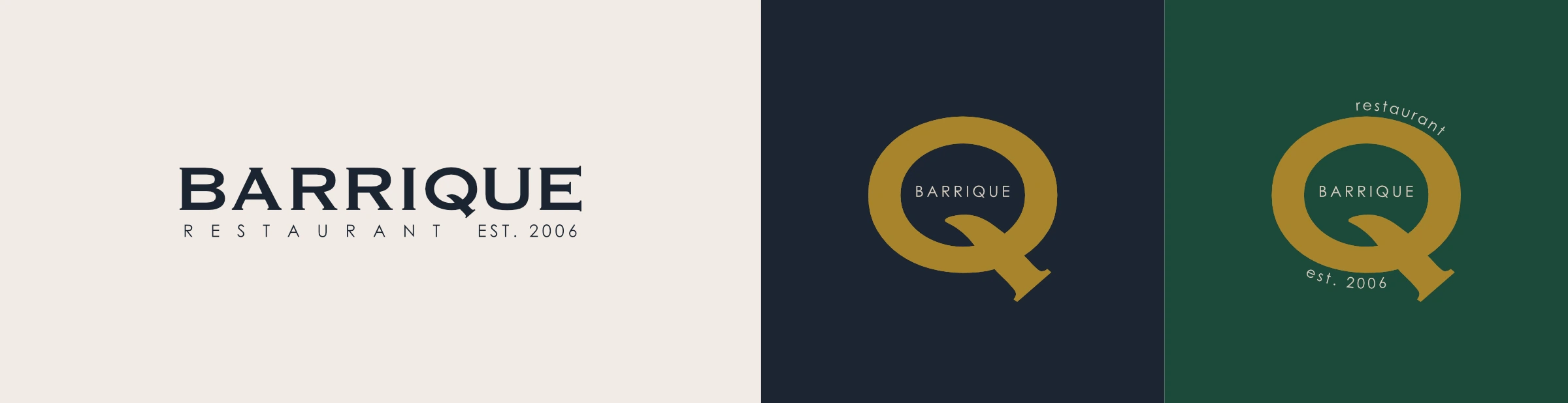
The client leaned strongly towards keeping the old logo, but with a new face. People knew the place by it, so no restart from zero. Rather an upgrade of what was there, and an identity built around it.
What was there before
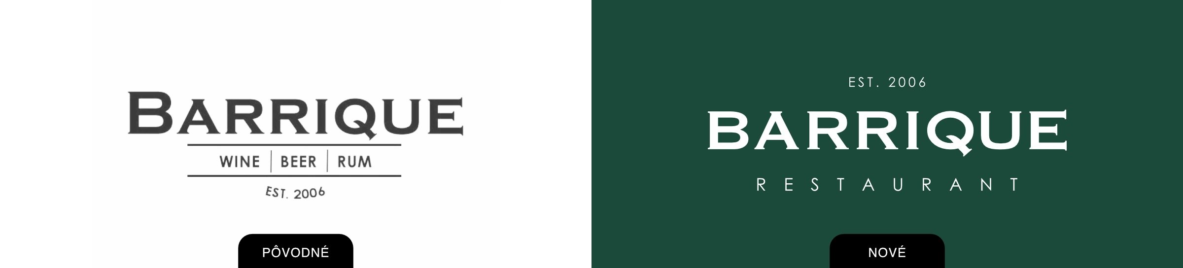
The old identity was essentially just a logo and nothing else. That nineties feel of an average establishment, the kind you walk past several of on any town square. Not a tragedy, but nothing you would turn around for on the street either, or say "let's go here".
So I kept the logo and only adjusted a few details, cleaned it up so it flows better and sits in line. Changes nobody will notice, which is exactly why they work.
A client rarely wants to throw everything away. They want what they have to finally work.
Four directions
I started with research. How the place looks now, where it stands, what surrounds it and what its history says. I also tried identity variations built on the street name (the surname Andrej Bernolák) and the house number 44, which later turned out to be a good move even though it didn't make the final cut.
I built four moodboards:
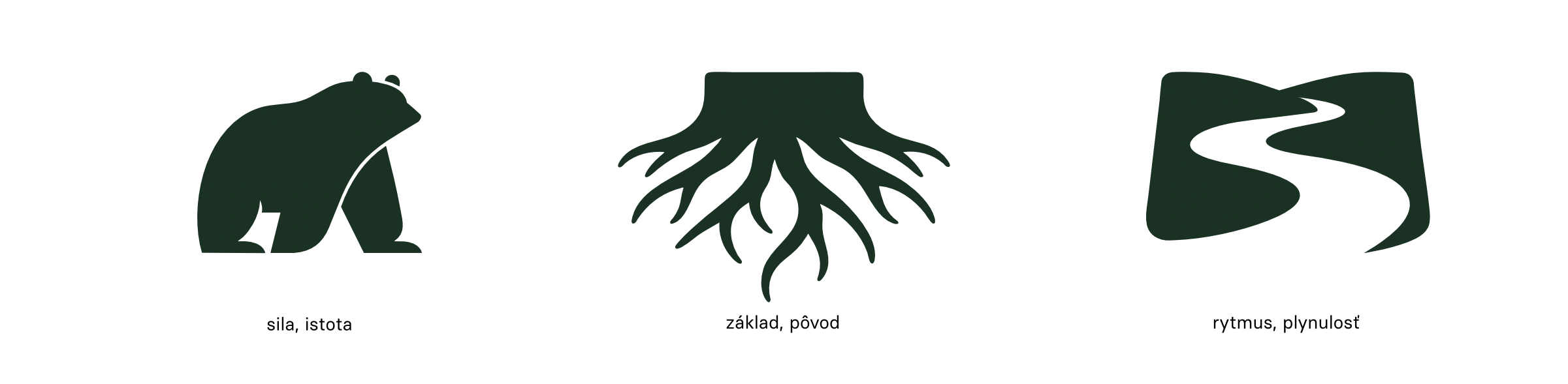
1. Traditional, local, honest. Roots, place, craft. The almost-original logo, three symbols inspired by the coat of arms of the Žilina region, dark green tones and atmosphere. Continuity over trend, for the "I've been coming here for years" kind of guest.
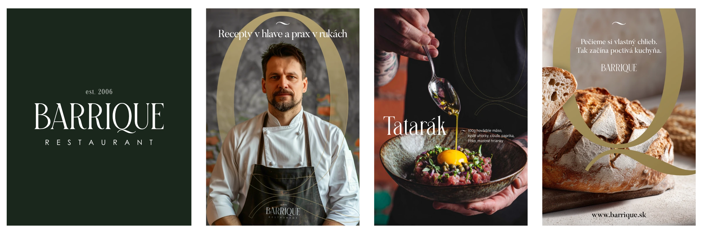
2. Discipline, precision, respect. The kitchen as a system, more emphasis on the food than on an after-work beer. Refined typography, a precise photographic style, controlled light, minimal noise. For guests who aren't looking for a pub but for a place with clearly defined standards.
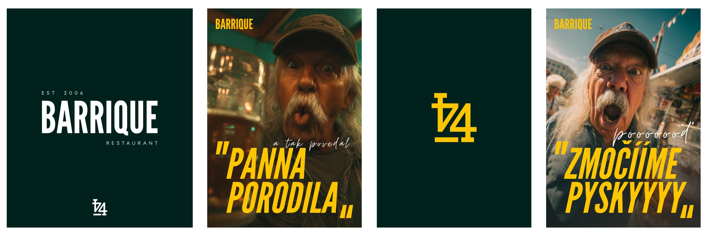
3. Lifestyle, rebel, regulars. Energy, character, freedom. A raw photographic style, close-ups of people and moments, slang and cheeky headlines. A brand with humour and guts. Plus the 44 symbol referencing the address Antona Bernoláka 44, one that works in slang too: "I'm heading to the forty-four".
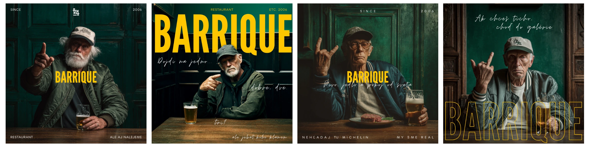
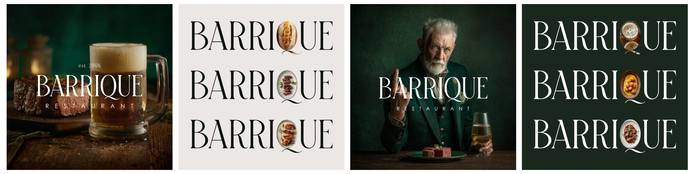
4. Bonus: a beer after work. A mood concept I added on top, because it was the one I enjoyed most at the time. Slowing down, relief, calm. One beer as a symbol, not a challenge. Less shouting, less plot, more vintage atmosphere.
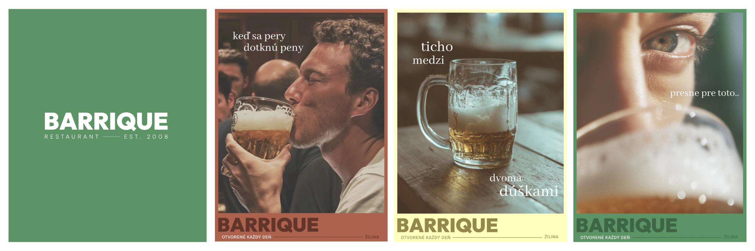
After a few days of thinking the client picked concept number one. From the second, though, he asked for the letter-Q idea and the photos with their own bread; from the third he liked the number 44 idea and the energy.
That's exactly how it should go: concepts aren't a contest with a winner, they're building blocks. The final is number one with the best pieces of the others.
Q, 44 and three symbols
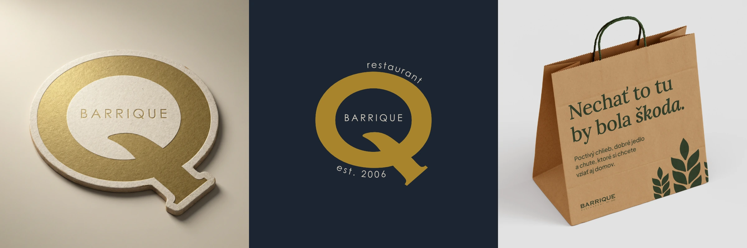
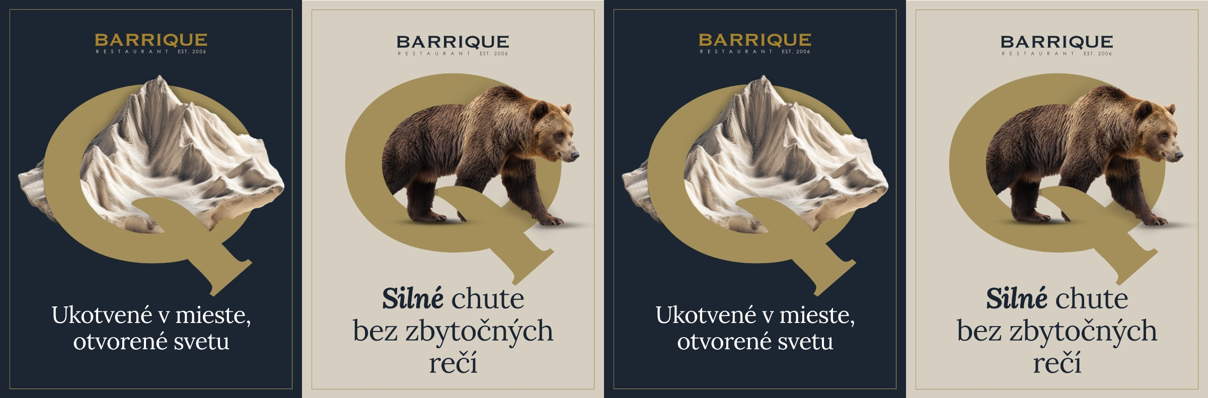
The letter Q from the word BARRIQUE became the icon of the whole identity. It works on its own on a beer mat, on a stamp, in a profile picture. Small, memorable and, above all, pulled straight from the logo people already knew.
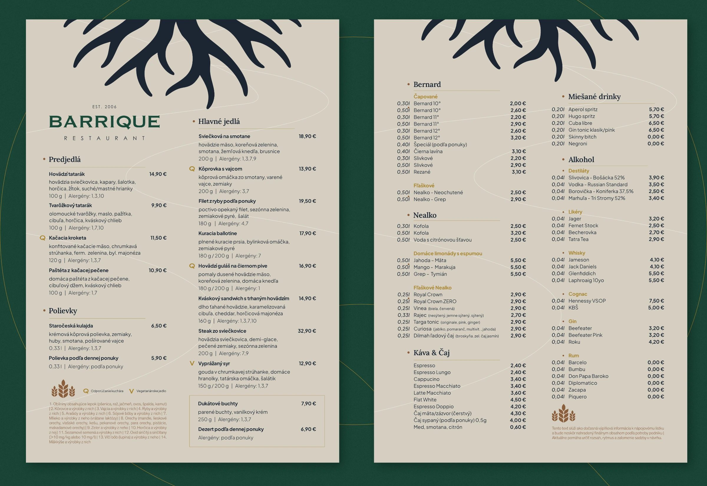
Alongside it I designed three symbols inspired by the coat of arms of the Žilina region: grain, roots and the river. Strength and certainty, foundation and origin, rhythm and flow. It was one of the first ideas; they work as the brand's anchor and naturally tie the place to Žilina. Something the identity can return to and push off from. Deliberately, though, they are not a load-bearing pillar the brand couldn't work without. The logo with the letter Q carries the foundation, the symbols just add depth.
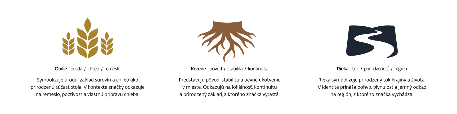
The third symbol was, incidentally, the only moment where the client and I went in circles. Roots and water passed right away. The third was originally a bear, which appears in the coat of arms as a sign of strength and courage, but the client wasn't sold on it. Perhaps also because of the negative connotations around the bear situation in Slovakia. We also tried a mountain, since Žilina is a town surrounded by mountains. Until we got to grain, which fits best: bread, beer, honest ingredients. Sometimes it's the third attempt that's the right one, and that's part of the process.
Colours and typography
The palette grew out of the interior. It's meant to be tuned to dark green with wooden elements (the roots), so I pictured that cosy atmosphere and added mustard gold (grain, beer), dark blue (the river) and limestone. Colours that don't shout, yet feel warm and pleasant both in the space and on screen.
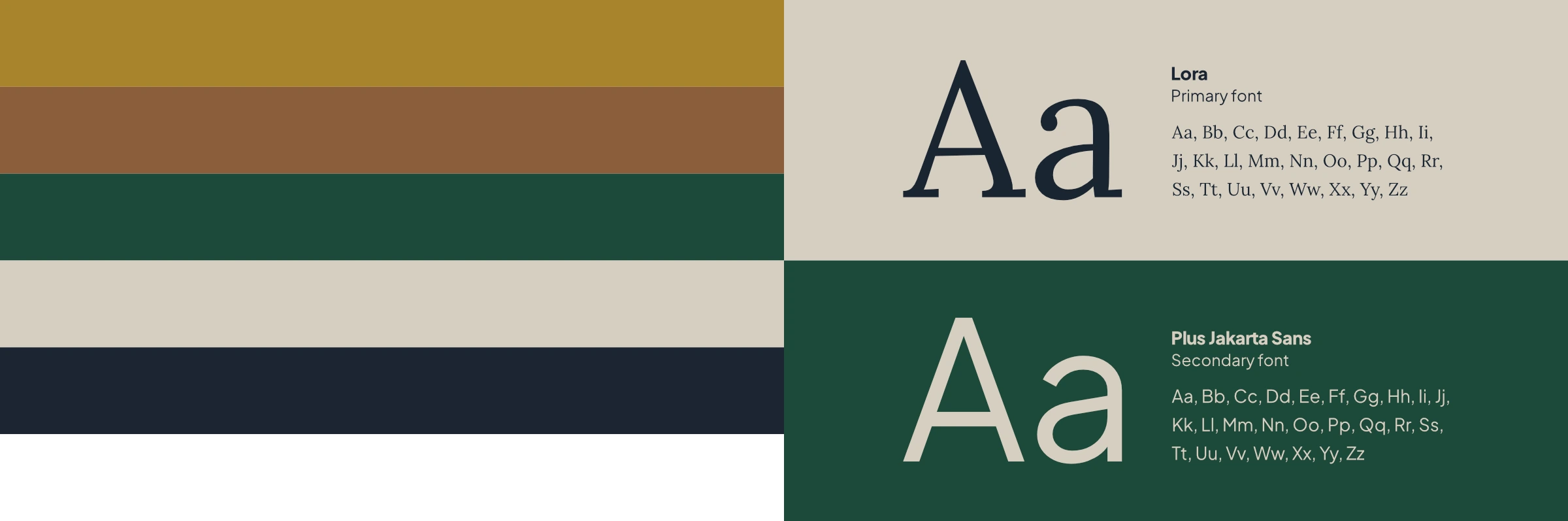
The typography stands on a pair of fonts. Lora, the serif headline font, carries character, elegance and local dignity; I use its italic sparingly, to highlight a few words. Plus Jakarta Sans holds the rest: descriptions, menus, navigation, everything that above all needs to be readable and consistent in print and online. The serif gives the brand a face, the sans does the everyday work. And I'll be honest, I didn't overthink it. Lora clicked with the logo on the first try, and when something clicks, there's no need to dissect it just to make the process look more thorough.
What came out of it
The final scope:
- the refined logo and the Q icon
- a brand manual in a simple, usable form
- menus (a food and drinks menu with a wine list)
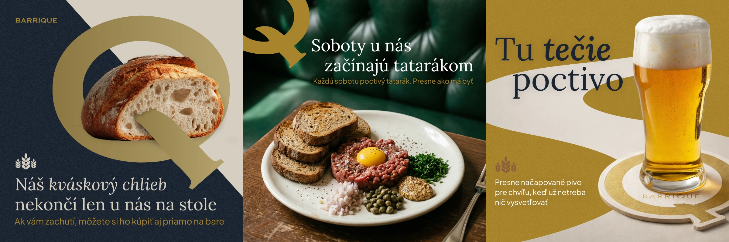
- offline brand applications: beer mats, a bread bag
- templates and direction for social media
- a website with the daily menu
A website with the daily menu
An identity without a website would just be a pretty folder on a computer. The goal was to get it to the place where people will actually see it when they're looking for somewhere to go tonight.
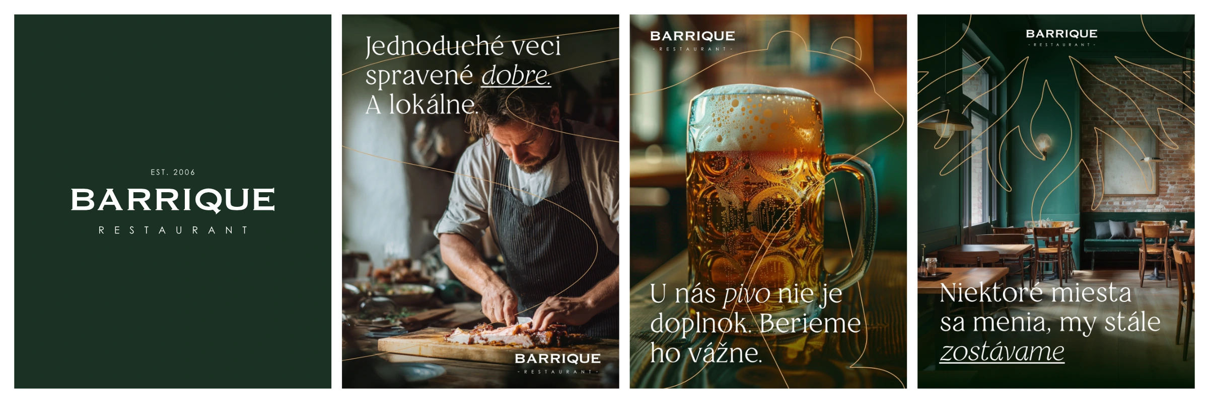
The website builds on the same visual language as the rest of the identity: the symbols, the font pair, dark green and gold accents. Nothing new, nothing extra. That's exactly the point — consistency across channels is the whole brief in one sentence.
The heart of the site is the daily menu. Not a PDF nobody updates, but an offer the restaurant can change based on what's on the plate today. A website that lives with the business, not a flyer frozen in time.
The place is currently being finished, so we're still waiting for the opening and the first reactions from guests.
What I'd do differently today
Two things.
First: I wouldn't develop so many concepts. Instead of four directions, I'd spend more time at the start absorbing how the identity should feel and, above all, who it is for. More listening at the beginning means fewer variations later.
Second: I'd lean on the symbols more. They're in the identity now, but they're not a load-bearing element the brand couldn't work without. If I were doing it again, I'd give them more weight, though I'm glad the identity works even without them.
Writing this into a case study may not be the best marketing. But it's exactly these admissions from projects that make better designers. And honesty is cheaper than pretending every project was perfect.
Full stop
Today Barrique has an identity that looks like it has always been there. A restaurant and bar primarily for locals, with a clear sense of quality. No pretence, rather the authenticity and ease a place like this should bring.
That was exactly the brief.
We created the identity and website for Barrique at NOUSOOS. If you're working on something similar, get in touch.